//Kevin Anderson /December 14 / 2012
Visual journalism is ‘not just for the big boys’
As we’ve noted here before on Knowledge Bridge, data journalism and data visualisation have been one of the biggest trends in journalism. Data journalism has long been used in investigations, but data visualisation is now leading to new forms of visual storytelling, topics which were recently explored at the news:rewired conference in London.
Data journalism was born out of the computer-assisted reporting, or CAR tradition, that started in the United States as far back as the late 1960s and really came of age in the late 1970s and the 1980s during the early years of the personal computer revolution. Journalists often point to The Guardian’s data journalism efforts and its pioneering data blog or the New York Times’ interactive team with their stunning and innovative visual projects, but in 2012, data journalism really went global:
- La Nación, Argentina’s second largest newspaper, has created a data team to dig into government documents and produce compelling data-driven features.
- In Colombia, Knight International Journalism Fellow Ronnie Lovler created a corruption monitoring site using the crowdsourcingCrowdsourcingTaking a task that would conventionally be performed by a contractor or…//read more reporting platform Ushahidi.
- The African Media Initiative has held data journalism training sessions in Kenya, Tanzania, South Africa and Ghana.
- The Data Journalism Handbook, freely available online, was translated into Russian.
- In the Kazakh city of Almaty, journalists created a crime map to show the dramatic increase in crime over the last year. (In Russian.)
Planning and creating visual journalism projects
The spread of data journalism is being driven by an ever increasing number of free or low-cost tools that allow journalists, even at very small organisations, to create data visualisations including maps, timelines and charts and graphs.
At the news:rewired conference, Paul Rowland, deputy head of online content at Media Wales, told attendees:
You don’t need a budget to do this, it’s not just for the big boys.
As Rowland said, working in regional or local media usually means:
- limited resources.
- a lack of cash.
- no dedicated developers.
- a hefty newspaper legacy.
That hefty newspaper legacy may lead people to question why to use data and visual techniques. The main form of storytelling has always been with “the slab of text”, Rowland said. He counters, “digital journalism without visual storytelling is like a newspaper without pictures.” Pictures convey emotion and have long enriched newspaper journalism. They help draw readers into a story. Similarly, visual storytelling is another way to get readers attention and hold it.
With no budget for expensive tools or dedicated developers, he said that it is important for small, local publishers to understand all of the free tools available to create engaging digital journalism projects. There are so many ways to display information and tell stories that the new challenge is to choose the best way to tell your story. Rowland had this bit of great advice:
Don’t try to show how clever you are, show how simple the story can be.
If it doesn’t make the story clearer or more engaging, then you might want to consider another technique. The key thing Rowland said is to think before you create and ask yourself, “What am I trying to say?”
Beyond that, he outlined his thought process:
- Is this story worth enhancing?
- What does it need? Context, location, collation, illustration or visualisation.
He recommended tools for each of these five different ways to enhance stories:
Context
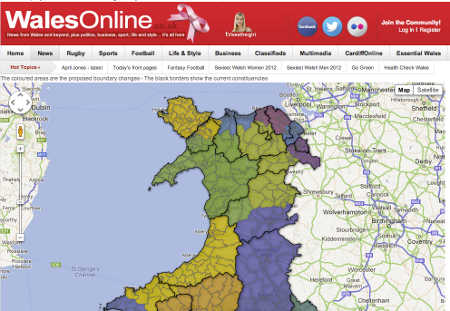
He recommended the timeline tools Timetoast and Dipity. I can’t recommend Dipity anymore because the service has not been reliable. Timetoast is a great service, and many journalists are now using Timeline.js. He also recommended Google Fusion Table Maps, an easy way to map information including points on a map, roads or zones such as political districts.
Location
Again, he recommended Google Maps and also a relatively new service called Meograph which combines time, location and multimedia.
Collation
He recommended Thinglink which allows you to add linked information to images and Storify, a service that allows you to collect social media updates around a story including Facebook and Twitter updates as well as Flickr and Instagram photos and YouTube videos.
Illustration
With this he recommended any standard gallery tool. If you don’t have a gallery tool, it’s quite easy to create galleries using Flickr, a photo hosting service owned by Yahoo.
Visualisation
For visualisations, he suggested Tableau Public and IBM’s Many Eyes. You can also do simple visualisations, really basic charts and graphs using the online spreadsheet service included with Google Drive, formerly Google Docs.
In the coming months, we’ll be going in-depth in how to use services like these and also how editors can develop the planning process and workflow similar to the one that Rowland uses.
Here is Rowland’s full presentation, which has a lot of great tips, both in managing data driven, visual projects, and also practical advice with the online services he and his team uses.
Article by Kevin Anderson


Leave your comment