Even the free tools offer a wealth of sophisticated information as is shown in the recommendation by the the not-too-biased Google Evangelist, Avinash Kaushik, who says:
Yahoo! Web Analytics and Google Analytics provide world class web analytics tools for free.
Custom reporting, advanced segmentation, advanced rich media tracking, auto-integration with search engine PPC campaigns, advanced mathematical intelligence, algorithmic data sorting options, complete ecommerce tracking, super scalable sophisticated data capture methods such as custom variables, open free and full API access to the data, loads and loads and loads of developer applications to do cool data visualizations, data transformations, external data integrations and more.
Of course, the Western web giants do not rule everywhere. In Russia, probably the most common tool is Yandex Metrica, Google’s major competitor.
Because of the technology used to obtain data, the numbers will vary from tool to tool, sometimes dramatically. For example, for one website we looked at Google Analytics showed 714,000 visits and a bounce rate of 68%, while Yandex showed 685,000 visits and a bounce rate of 20% for the same time period. This doesn’t mean that one is right and one is wrong, but it does mean that it is important to know the differences, especially as advertisers become more savvy about metrics and demand more targeted delivery of their ads.
This has two implications: first, it can be very useful to have two different tools on your site, allowing you to make comparisons; second, it can be important that one of your tools is the industry standard in your region so that advertisers can compare easily against other websites. This often means Google Analytics, which is why we focus on it on our site, or in many Russian-speaking countries Yandex Metrica, or having both installed on your site.
Since these are two major players internationally, it can be useful to understand why you will see different metrics for the same website:
- Visits – GA may be higher than Yandex -Yandex suggests placing the tracking code inside the body of the webpage, whereas Google Analytics requires it to be placed in the website header. This may seem minor but if someone starts loading a page, and hits the stop or back button before the code was run, they will not be counted. If you had placed the Yandex code near the bottom of your site (something Yandex advises not to do, but is possible), it may not have had a chance to run yet, but the Google Analytics code would have already run since it is in the header – the first thing to load – thus resulting in Google Analytics counting the visit, but not Yandex.
- Total Pageviews – GA may be higher than Yandex – If someone refreshes a page within 15 seconds of their visit, Yandex will not count this as a second pageview, whereas Google Analytics will. This will not impact unique pageviews, but it will impact total pageviews.
- Bounce rate – With Google Analytics’ default setup, any visitor who only visits one page and then exits is considered to have “bounced”, even if they spent 20 minutes on that one page with no events. Yandex, on the other hand, will only count someone as “bounced” if they only visited one page and spent less than 15 seconds on that page before exiting. Yandex’s bounce rate, therefore, is a truer indicator of people who have come to your website and not found what they were looking for.
- Demographics – Unlike Google Analytics, Yandex Metrica will try to determine the age and gender of the visitors, and run reports based on these dimensions.
So as you can see, for a site with a lot of traffic you can learn very different information from Google Analytics and Yandex Metrica. It may be worth including both tools so you can get two perspectives on your users.
]]>Controlling Your Reports
One important feature to note is that you can add an “annotation” to any line graph by double clicking on a certain date and then entering a note into the pop-up text box. This can be very useful if multiple people are viewing this profile and you want to indicate that a significant editorial or technical event happened on a certain day that could account for significant changes in metrics.
When viewing a report in the standard table mode, you can change the column that it sorts by, by clicking on the column label. The arrow beside the metric name will indicate which variable it is sorting on.
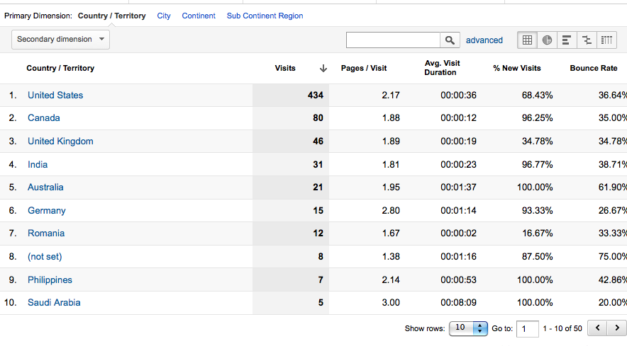
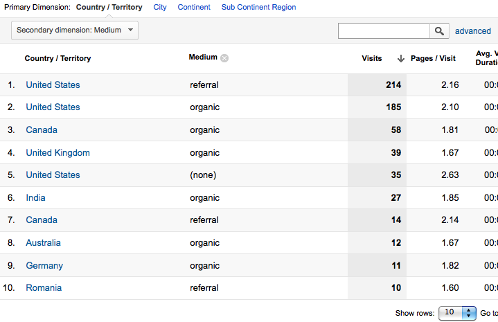
Standard reports automatically select a primary dimension, but in some cases it is possible to change the primary dimension, and usually it is also possible to add a secondary dimension. For example, click on Demographics > Location. By default, the primary dimension of this report is Country / Territory. Across the top you can change this to City, Continent, etc. You can also add in a secondary dimension to further break down your metrics. For example, we could choose Medium. This would result in each row representing a combination of the country and medium the visitor came from.
When viewing a report, the default view is usually a line graph or map at the top, and a table of values at the bottom. These views can also be changed.
For example, with some reports, such as New vs. Returning, you can switch the graph view to a motion bubble chart by clicking on the toggle button at the top of the graph. This could be useful if you wanted to view a graph with more than 2 variables, since you can include size of the bubble as one of the metrics. You can also “play” the graph to see how the values change over time.
More powerful, though, is if you scroll down to the table on the top left hand side, beside the link “advanced”, you can switch the view.
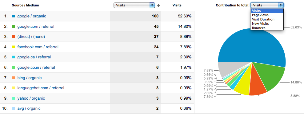
If you click the second button you will see a pie chart beside the table. You can change what the pie chart shows your report relative to. In this example, it shows each Source/Medium as a percentage of the total visits, but you can change that to a percentage of the total Pageviews, Bounces, etc.
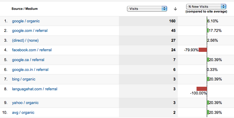
The third button shows you a performance bar chart, which simply adds a horizontal histogram to your metrics. The fourth button is very useful – it gives you a bar chart comparing each value to the site average. You can also change which metric it graphs.
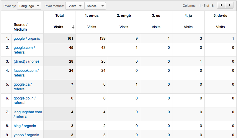
The last button shows you a pivot table of the report. In the pivot view, the primary dimension will appear as row headers. You can select different columns by selecting the drop-down beside “Pivot by”. You can also select what metrics appear in the table. In this example, I’ve shown the number of visits for each Source/Medium, based on the language of the visitor:
Advanced Segments
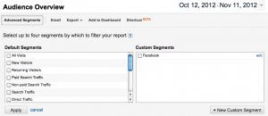
Advanced Segments are a critical tool to be able to use Google Analytics effectively. Often you want to observe, or compare, what specific types of users are doing on your website. At the top of a report, beneath the date selection, click the button Advanced Segments.
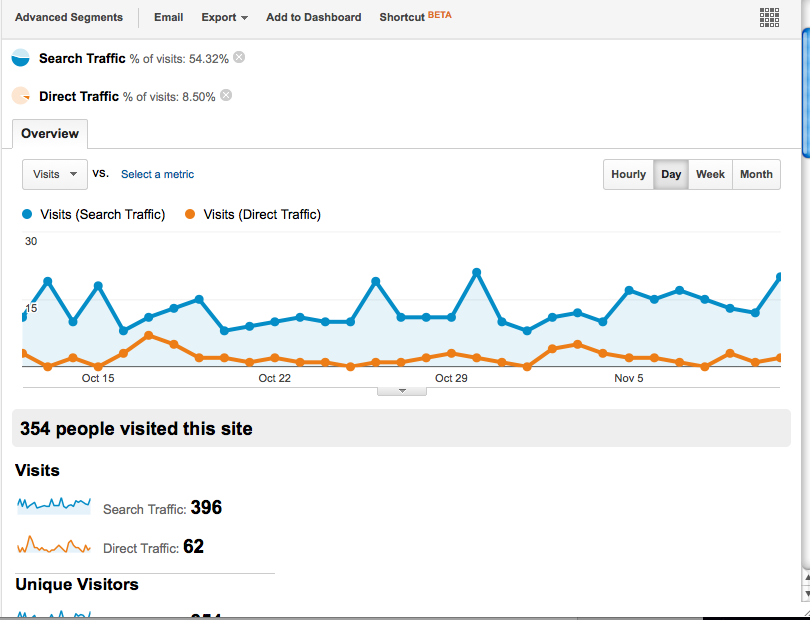
Here you see a list of default segments to select from. For example, we can select “Direct traffic” and “Search traffic” if we want to see how they differ in their interactions with your website. Now, any report you select will show a comparison between the behaviour of direct traffic and search traffic.
To get rid of the segmenting, simply click the x’s beside the segments at the top of your report.
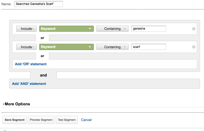
Even more powerful, is the ability to create custom segments. Let’s say we want to see the behaviour of all the people that searched for some version of our website. First click the Advanced Segment button, and then click “+New Custom Segment” in the bottom right-hand corner. My website is called Ganesha’s Scarf so I want to include people who came to the site by searching “Ganesha” or “Scarf”
First create a name for the segment. Then, under the first option, make sure “Include” is selected. Find Keyword from the Dimension dropdown, which refers to the search keyword. And then we can use “Contains” Ganesha. We could also use exact match if we wanted those that searched just for “Ganesha”.
Then, under OR, select to add another option. Repeat the same steps as the statement, but this time use contains “Scarf”. Now we will be including anyone who’s searched anything with the word Ganesha in it, or the word Scarf. You can test or preview the segment before you save it.
Now whenever you click “Advanced Segment”, on the Custom Segments side you will see the segment you just created. Selecting this will show us whether people who are searching for our website are actually finding what they were looking for, or is their bounce rate high.
Custom Reports
Lastly, for reports, we will look at custom reports. You may often find that the standard reports are not including the metrics you are interested in. In those cases, you can easily build a custom report. Click on the Custom Report heading, and then the “+New Custom Report” button. In this example, let’s say we want to know how many unique visitors visit our website from different countries. The standard Location report gives us the number of visits, but not the number of unique visitors.
First name your report. Then name your report tab – a custom report can have multiple tabs. Add in the metrics we would like to see in our report. In this case, we want to include “Unique visitors”. You can include multiple metrics to that particular group such as visits, pageviews, etc. We can also create a second metrics group which will appear as a toggle link on the top of our report and could contain a different set of metrics. Lastly, select the dimension – in this case “Country”.
Once you’ve saved your custom report, it will always appear when you click the “Custom Reports” button on the menu, as well as in the sidebar when you are viewing any Custom Reports.
Enabling AdSense
AdSense is the Google Ad network that allows you to get revenue on your website by showing your users relevant ads and being paid each time they click on them. It’s important to maximize your revenue by understanding when, where, and why users click on your ads and, over time, optimize the way you display ads. The best way to do that is to incorporate your AdSense data into your Google Analytics account.
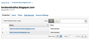
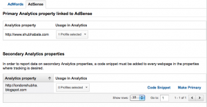
To connect your existing AdSense account to your Google Analytics, first go to the Admin panel and select the account you want to connect.
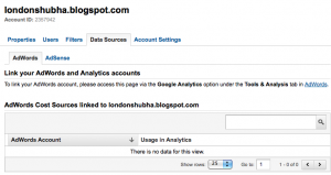
Next, click the Data Sources tab.
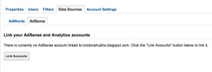
Click the AdSense tab and click to Link Accounts.
You will be asked which property in that account is the primary one that contains your AdSense ads. Once you select the appropriate web property, your AdSense statistics starting that day will be available in your Google Analytics reports.
In brief, you can see your AdSense report summary under the standard reports in Content > AdSense. You will also now see that in any of the standard Demographics report, there is a toggle link to see AdSense for the report. For example, if you click on Location, and then click the AdSense link at the top of your location report, you can see what country’s visitors brought you the most Ad revenue.
Enabling AdWords
AdWords is the opposite end of the ad network spectrum – it allows you to display ads on other websites which are part of the Google ad network.
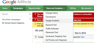
To enable AdWords in your Google Analytics account, you need to first login to your Google AdWords account. Note that the Google AdWords account must be setup with the same login as your Google Analytics account.
Under “Tools and Analysis” select “Google Analytics”.
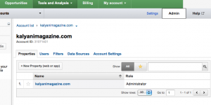
This will bring you to a list of Accounts in your Google Analytics account. Click the Admin button in the top left corner.
Select the Account you want to link to AdWords – the one you are using AdWords to drive traffic to.
Click on the Data Sources tab. You will see the sentence: “The AdWords account for xxxxx@gmail.com (601-133-1259) will be linked to www.youraccount.com” and below that a button to “Link Accounts”.
Click Link Accounts, and make sure to select “Auto-tag my links”. Select the drop down and select which profiles you want to link AdWords to.
Then you will see all the linked profiles in the table.
In Google Analytics, you can now see several standard reports under Advertising > AdWords. You can get an in-depth analysis of what ad word campaigns are working for you by seeing not only who is clicking onto your site, but their bounce rate, the pages they visit, etc. This will help you understand whether the money you are spending is resulting in quality visitors, as opposed to just an increase in traffic. For example, if you find the bounce rate is very high, then it might mean your ad needs to be reworded, or perhaps you should be linking to a different landing page.
EXERCISES
- Compared to the average, what percentage of visits to your site were from your target region/country?
- Show a pie chart of what Medium people came to your site from who were using mobile devices.
- What are the top 5 landing pages for people that came through your site through a search, but who did not search directly for the name of your website or news organization?
- Create a custom report that shows you the number of unique visitors that visited different pages on your site.
- Create a word cloud view of search terms that people come to your site using. Now create the same word cloud, but removing the top 3 search terms.
- If you have AdWords – see what times of the day people are most likely to come to your website.
- If you have AdWords – see what the bounce rate is like for people that come to your site through your campaign, and are new visitors.
- If you have AdSense – what pages on your site resulted in the most AdSense ads viewed? The highest revenue?
- If you have AdSense – show a pie chart showing the amount of revenue that new visitors result in versus returning visitors and another for the country visitors come from.
Here we explain how Google Analytics works, how to set it up on your website and share it with your staff, what the definition of “metrics” and “dimensions” are, and where some of the most common standard reports can be found. Lastly there are some exercises so you can try what you’ve learned.
What is Google Analytics and how does it work?
In order for a website to use Google Analytics, it must carry a small piece of tracking code which runs when a person visits that site. The tracking code either creates or modifies Google Analytics cookies (a little snippet of information that a website stores in your browser to identity you), sending this cookie data to the Google Analytics server.
Two things can stop this from working properly: if first-party cookies are blocked (not third-party), or if Javascript is disabled. Some estimates say less than 5% of internet users have blocked first-party cookies.
One last note is that if the code doesn’t load in time – for example the page is loading very slowly – then it is possible the visit will not be recorded. However, Google recently changed their tracking code to an “asynchronous” code. Amongst other advantages, this code is put in the header of a website instead of the footer, so it is more likely that the code will be run, even if there are issues with the entire page loading.
Accounts, Properties and Profiles
Before you create an account, it is useful to understand the hierarchy of Google Analytics.
An account is the topmost level of organisation for Google Analytics. It allows you to manage multiple web properties (usually a website), which can have different profiles.
The default profile should always be the entire web property (for example, the entire website or the entire domain), but you can also make other profiles which filter the data to look at a subsection of your audience, or look at specific subdomains of the website. This can be useful if your digital newsroom is separated into content silos – the editor of sports can easily see his or her web statistics separately from the editor of business.
How to create an account
1. Go to www.google.com/analytics and sign in with your Google login and password. For future purposes, it is best to use the same Google account you use for AdSense or AdWords.
2. Click the Admin button in the top left. You will see an Accounts tab. Under this tab, click “New Account”.
At a minimum, name your account and add the website that you want to track.
3. Select http or https from the dropdown. If you aren’t sure which one to use, go to your website and see what appears at the front of the URL. You can add more websites later.
4. Select a timezone and industry category (the industry category is for Google compare to similar industries).
5. Select “Share data with other Google products”, as this will allow you to incorporate AdWords or AdSense into your Google Analytics account.
Once you have created the account, you will be shown a tracking ID. A tracking ID always starts with UA, followed by the account number, and then the profile ID. So an ID UA-XXXXX-Y means that XXXXX is the overall account, and Y is this particular profile.
6. To access the code you will need to put add to your website, scroll down to “Website tracking” and select “What are you tracking?”.
7. Select the website you are tracking. You will then be given the tracking code to put on your website.
How to give other people access to your account
You probably have other people in your organization that you want to be able to access the analytics. It is important that they do not create a new Google Analytics account on their own Google account, instead you should give them rights to view the account you just created. The reason for this is that since cookies are based on a user visiting a website, it can confuse things if multiple accounts are trying to update a user’s cookies. The data will likely be incorrect.
1. Make sure that you are administering your account, not your property or profile, then click on the Admin button in the top right.
2. Underneath the menu, click either on “Account List” or the name of the account that you see directly after “Account List”.
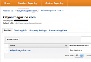 3. Once you are in the account admin screen, click the Users tab.
4. Click the button to add a new user. You can give them user rights, or admin rights. You can also select just specific profiles in the account for the user to be able to see.
Metrics and Dimensions
Google Analytics splits its data into “metrics” and “dimensions”. Simply put, metrics are anything that gives you numbers, and dimensions are ways in which you can categorize those numbers. For example, number of visitors is a number, so it’s a metric, but the way you want to view those numbers – by day, by month, by country, by device – those are dimensions.
Common Metrics
- Visits (Sessions) – The number of times that anyone visited your website. One thing to note is that a visit is considered over if someone leaves your website, closes their browser, is inactive on your site for over 30 minutes (the 30 minutes varies by analytics tool and can be customized), or when it hits midnight in your timezone. This means that if someone is interacting with your site and they go get lunch for over 30 minutes, when they come back and start interacting again it will count as 2 visits. For more detailed information – http://support.google.com/analytics/bin/answer.py?hl=en&answer=2731565
- % of new visits (or returning visits) – When a user visits your website, Google Analytics will see if they already have a cookie for this site, indicating that the user is a return visitor. This means that a visitor may also be considered new if the user has cleared their cookies, or if the cookie has expired (after two years for Google Analytics)
- Average visit duration – Adds together the length of time of every session and divides it by the total number of sessions. Google calculates “length of time” by calculating the time between when a user came to your site, and the last thing the user does on your site. Unfortunately, leaving your site is not something that Google can get a timestamp for – it does not count as an event on your site. Therefore, the length of time the user spends on the last page before exiting is usually not included in the Average visit duration calculation. Also a user that only visits one page, does nothing, and then exists will have a length of time of zero even if they spent 15 minutes reading that one page. Therefore, the average visit duration will always be an underestimation. It is worth noting that not all Analytics tools work this way and that there are ways, through coding, to change this functionality. However, since Google Analytics is one industry standard, it is perfectly acceptable to use this value for time on page or average visit duration.
- Bounce Rate – The number of users who only visit one page and leave. Sometimes the bounce rate is a good indication of whether or not the “right” people are visiting your website and whether or not it’s easy for them to find what they need. However, if you have a blog for example, you would expect a high bounce rate since all the articles are on the homepage anyway. Even if someone spends 5 minutes reading your blog, they will still be considered a bounced user unless they click on a page or have an event.
- Pages/visit (or average page depth) – This is the average number of pages that are viewed in a session. Repeat visits to the same page during a session will be counted as separate page visits.
- Pageviews – This is the total number of pages that were seen. Repeat visits to the same page are counted as separate page views.
- Unique pageviews – This is the number of unique pages viewed, aggregated by all the visitors. If you see the number of unique pageviews for a specific page, it would count the number of sessions during which that page was viewed at least one time. The total number of unique pageviews tells you how many pages people visited, but not including their repeat visits to the same page during the same session.
- Unique visitors / Visitors – The number of different users, or at least different cookies, that visit your website. Of course, if a user comes from a new browser, different computer or device, they will be counted more than once. Also, when people clear cookies and appear as new visitors, they will be counted more than once. Since people often clear cookies manually, the industry standard for reporting unique visitors to your site is to report by month, and not any longer like by year, where many users may be counted more than once.
Common Dimensions
- Visitor Type – New or returning
- Medium – The way someone came to your website. (none) refers to a direct visit where someone typed the URL in or used a bookmark; organic refers to a search engine; and referral is if they clicked on a link other than a search engine or campaign. Also, for campaigns, Medium could be a custom parameter or ppc if it is an AdWords campaign using autotagging.
- Source – This is the more specific source of the referral to your website. It is most often the domain or URL where they clicked the link to your site. It can also be a campaign custom parameter, or Google if they came from AdWords with autotagging. Again, if the visitor just came directly it will say (direct).
- Continent, subContinent, Country, Region, Metro, City – Google Analytics will try to source the location of the visitor based on the IP address. If it cannot determine the location it will use (not set). Unfortunately in some regions of the world this can happen quite frequently – in fact the majority of users may be from not set.
Standard Reports
Reports are where Metrics meet Dimensions. For example, you might want to look at the behaviour of new vs returning (dimension) visitors. You could compare the number of visitors (metric) who are new and the number who are returning, or the number of unique pageviews (metric) for new visitors compared to those for returning visitors. Perhaps you want to see the bounce rate (metric) for the visitors from your country vs from other countries (dimensions).
In the standard reporting view, which is one of the buttons in the main menu, there are some useful reports that you can pull up from the sidebar:
- Location, under Audience > Demographics
- Mobile, under Audience > Mobile > Overview
- Sources, under Traffic Sources
- Search terms, under Traffic Sources > Sources > Search > Organic
- Social Network overview under Traffic Sources > Social > Sources
- Pages visited under Content > Site Content > All Pages
- AdWord Campaigns under Advertising > AdWords > Campaigns (note this must be enabled)
- AdSense Overview under Content > AdSense > Overview (note this must be enabled)
For every report in Google Analytics, you can set the date frame and the range. To set the date frame select the arrow in the top left-hand corner beside the current date frame and choose a start and end date.
You should immediately see your graph change dates. By default, you will notice that the analytics 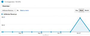 graph reports on the metric by day. You can change this at the top of your graph by toggling the day, month, or year buttons.
You can also compare to a previous date range by clicking “Compare to” when you select your start and end dates.
EXERCISES
- How many unique visitors did you have yesterday, last week, three months ago for the month?
- How many visits in the last week were from mobile devices? What were the top three mobile devices used?
- What are the top three countries, based on number of visits, to your site?
- For the people that are from your country, what is the bounce rate?
- How many visits to your site were from referrals? What were the top three domains that they were referred from?
- Compare the sources of visits to your site between this month, and last month. Is there a significant difference? Why do you think that is?
- Compare the number of visits in general between the last week of this month, and the last week of last month. If there is a difference, then why?
- What were the top five pages visited in the past week? Does that surprise you? If so, how could you use that information to change your editorial flow for next week?
You might assume that your Facebook news feed is a simple list of every update posted by your friends, but in fact Facebook picks and chooses which updates you see using an algorithm called EdgeRank. TechCrunch has a good explanation of how EdgeRank works:
You may not realize it, but News Feed only displays a subset of the stories generated by your friends — if it displayed everything, there’s a good chance you’d be overwhelmed. Developers are always trying to make sure their sites and apps are publishing stories that make the cut, which has led to the concept of “News Feed Optimization”, and their success is dictated by EdgeRank.
EdgeRank tries to calculate which items will be most likely to please users based on the relationship between poster and reader, the type of content posted, and its recency. The success of your post, measured by how many of your followers see it, will rely on how well it meets EdgeRank criteria.
But Facebook is known for occasionally changing its EdgeRank algorithm. In September, two high profile social media marketers — Jeff Doak at Team Detroit and Geoffrey Colon at Social@Ogilvy — claimed that tweaks to the algorithm had slashed post visibility by 40 to 50 percent. That means that any given post now has a much lower likelihood of being seen by your followers than it did before the changes. Other websites have done the math on their own Facebook posts and have confirmed that this is a significant problem.
Why would Facebook do such a thing? One answer may be that by cutting access to fans, Facebook can push more companies into buying Promoted and Sponsored Posts, a new service that was launched in May. Says Ars Technica:
In some cases, Facebook clickthroughs are down by as much as half, despite a huge growth in likes. Even worse, some brands noticed that this drop in traffic coincided with a new Facebook feature called “promoted posts” through which brands can pay cold hard cash to push their content out to more news feeds than they would normally reach—and the brands are not happy about it.
This juxtaposition of events makes it look like Facebook is artificially driving down traffic, then holding the old level of traffic hostage in order to generate some new revenue.
Facebook denies any major change to its EdgeRank algorithm and maintains that it continues to get the most relevant posts on any individual’s newsfeed. Ultimately though, as Business Insider says:
The underlying issue, however, is that advertisers know that Facebook’s Edgerank algorithm can be adjusted in their favor or against them, and that only Facebook can choose how that level is set. And there’s nothing they can do about it.
Out of your control
It’s not the first time that Facebook’s tinkering has had an adverse impact on traffic to media sites. In April 2012, The Guardian and the Washington Post both saw a dramatic collapse in the number of people using their social reader apps. The Wall Street Journal, Mashable and MSNBC.com also saw their numbers fall off a cliff.
Initially it was thought that users had tired of Facebook’s ‘frictionless sharing’, in which the social network automatically shared with their friends the articles that users read, or that perhaps people had only experimented with new social reading apps for a brief time before abandoning them. But The Guardian’s Tanya Cordrey, director of digital development, told Nieman Labs that the problem lay squarely with Facebook:
Since our app launched in September last year we have repeatedly seen upswings and downswings in use depending on the type of content being shared by users, and the way that this user activity has been displayed within Facebook. Major changes made in the last month or so by Facebook have indeed resulted in a fall in usage since early April. However, this is not a signal that users are “abandoning” social reader apps, rather that articles which were previously surfaced predominantly in a user’s newsfeed are now much less visible.
Managing the risk
Any social media strategy that is overly focused on a single tool is unnecessarily risky, putting you at the mercy of a third party company over whom you have no control. In the case of EdgeRank, you could deal with the drop in traffic by just paying for promoted posts. But as an independent newsroom with a limited budget, it’s important to consider the likely return on any such investment, especially as it won’t guarantee the restoration of previous high levels of traffic. Even more importantly, though, such a move would not protect you from future changes by Facebook.
A more robust response is to mitigate the risk by diversifying your use of social media. Facebook isn’t the only game in town. Other social networks, such as Twitter, Pinterest, Vkontakte, or Google+ can also drive significant traffic to your site. Although it’s impossible to say whether or not any of them will charge for use in future, broadening your social media horizons will give you more choice if uncomfortable changes ever are made.
Begin by comparing your audience demographics with those of the social networks available to you and focus on developing a presence in the network which most closely matches your target audience. Developing a new community will take time, but it will help to future-proof your social media strategy and ensure that you reach as many people as possible.
Coping with Facebook’s changes
Of course, it’s impossible to simply walk away from Facebook, especially if you’ve already built a valuable presence there. So how can you best cope with the changes to EdgeRank? In a long and comprehensive blog post, American digital editor Steve Buttry provides a useful checklist of things to keep in mind when creating your posts. It is essential reading for everyone running a Facebook account, and here we can only summarise his main points:
- Photo and video posts get more engagement and therefore more views.
- Start conversations: Posts with a conversational tone will gain more engagement, and thus show up in more news feeds.
- Include links that are not shortened so that users know where they are being sent.
- Use keywords in your post, so use fewer acronyms, spell out the entire name of a sports team, etc.
- Monitor your stats to determine the best time of day to post an update.
- Encourage personal engagement with your stories by your journalists and sources.
- Encourage sharing from your site.
You will undoubtedly have to experiment to see what works best for your audience. It’s important to remember to change just one variable at a time and measure the effect of that change to see what works and what doesn’t.
The bottom line is that all social networks are subject to constant upheaval and it is important not to cling too tightly to one way of doing things. Just make sure that you always keep audience engagement in mind.
]]>Good responsive design means customers will not be repelled by a cranky mobile site; instead, they will spend more time on the site and be more likely to read its content. Also, done properly, responsive design saves on development costs by eliminating the need to design separate sites for specific devices. In addition, using a single URL improves site analytics and SEO performance, and sites can easily be resized for new viewing formats.
Despite this endorsement, some disagree – the jury is still out when it comes to whether a news outlet should create separate mobile websites, or a single responsive design site. In fact, as Americans approach the Presidential elections, each of the two incumbents have chosen different approaches to their mobile strategies, which provide a good illustration of their strengths and weaknesses – President Obama’s website uses responsive design whereas Mitt Romney has a separate mobile site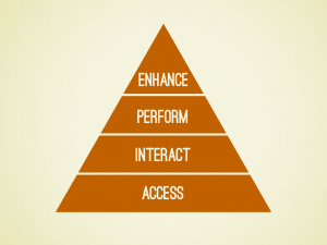 .
.
Brad Frost compares their websites using mobile designer Kristofer Layton‘s hierarchy of mobile needs which describes, in increasing importance, what a website should provide to its users.
Frost points out that using responsive design allows you to provide the same content more easily. In this case, Romney’s mobile website has far less information than the desktop version of his site.
Frost also points out that redirection to a mobile site sometimes gets missed, especially at lower levels of the site, which can cause problems with social sharing. A desktop user may end up clicking a link to the mobile version of the story, and vice versa.
On the other hand, Obama’s responsive design website has some great features but it attempts to do some fancy work with navigation menus, which unfortunately don’t end up loading on all sites. Romney’s menu may be simple in design, but it’s efficient for the user, and it works. Likewise, one must be careful when working with long articles or supplementary information with responsive design. In Obama’s case, some pages have too much content which requires scrolling down a long way.
Lastly, performance is an important point, especially in countries where mobile internet connections are not consistently fast or people pay based on data usage. Responsive design has a poor history when it comes to performance. According to the CTO of blaze.io, Guy Podjarny, only 3% of the small-screen versions of websites have significantly better performance than their large-screen counterparts. If you have a mobile website, Mobitest allows you to test its performance.
Responsive Design for News Sites
The Boston Globe is heralded as one of the (recent) pioneering responsive design websites for its premium content site. Although it’s easy to point to examples of big newspapers with large budgets such as The Boston Globe doing technically innovative work, earlier this spring, a small liberal-arts college in the US produced a responsive design version of its student paper. Two college students working on the Berkeley Beacon decided to use the Boston Globe example to create its own low-cost responsive design site. It is focused very much on looking like a slick print article with each article just having a resizing photo and the article text.
One challenge they have is that at the moment, there are no ads on the mobile view of their site. When they do put ads on, it will involve some careful design to ensure it does not clutter their minimalist layout. The paper’s Editor-in-Chief said: “I don’t want to disrupt the reader experience just to be generating a lot of money…Maybe once our traffic levels are really, really steady and people are just automatically going there all the time, we might do more and more ads.” Another student paper, the Daily Californian serving UC Berkeley and the surrounding area, also made the switch to responsive design when they overhauled their website using a WordPress CMS.
If you’d like to dive deeper into how to approach responsive design – down to the details – check out this analysis by the makers of the Boston Globe’s site. It skims over the why and goes straight into the how, including such details as which design software they decided to use (InDesign), and why they decided to start their design at 960 px and use that as a base when designing for the smaller screens.
Ultimately, it is important to remember that, responsive design or not, you have to cater to your growing mobile audience and their needs. The US Presidential example demonstrates that responsive design does not automatically equal a better user experience if you don’t first think carefully about what your user is looking for.
An interesting practical read on how to approach a responsive design website and, to some extent, a mobile website in general, is an article by Ste Everington, lead designer of BBC TV’s webpage. He described in detail the BBC’s thought process and design process in designing their new website. A couple of takeaways from Everington, that apply to a responsive design site or even a regular mobile device site are to:
- Define the different groups of tablet sizes that you need to design for.
- Understand your user’s journey (through metrics or user surveys). You likely have two groups of users: “I know what I want”, and “I don’t know what I want”. Design a site that works for both of those groups so it is both easy to navigate and easy to browse.
Whether you use CMS themes and plugins or develop a custom site, and whether you use responsive design or create a mobile site, the time is approaching that no website can ignore its mobile-audience no matter what region of the world you may be in.
]]>Understanding advertisers, ad auctions and types of ads
First, it is important to understand how an ad gets selected for display on your website and how much the advertiser will pay. Usually this is done through the real-time ad auction, which automatically matches advertisers who have signed up to place their ads with Google AdWords with websites looking to host advertisements through Google AdSense. The ad auction consists of a pool of relevant ads that are bidding for your space, and based on their bid and their likely performance one ad will win.
To determine who wins the auction, Google assigns a quality score for each ad based on a few factors including the ad’s past performance. Google creates an AdRank which takes into account the quality score and the maximum CPC (cost per click) that the ad is willing to pay. The advertiser with the highest AdRank wins that spot on your site, but what they pay is based on their quality score, and the AdRank of the other bidders. This rate, which is not necessarily their maximum bid, is therefore heavily impacted by the amount of bidders in the auction pool.
Watch this 5-minute video for all you need to know about Ad Auctions (and remember that in YouTube you can always click the CC button to close caption into another language).
Advertisers who are part of AdWords also choose one of three types of ways that they want to target their ads:
- Contextual targeting is when the advertisement’s keywords (entered by the advertiser) are matched against words used on the webpage.
- Placement targeting (or managed placements) is when the advertiser hand-picks websites they want to advertise on.
- Interest-based advertising is when ads are shown to specific audiences based on the advertiser choosing from 1,600 interest categories, and matching them to a specific audience based on a combination of your website’s keywords and the users’ cookies (small files that contain information on other sites they tend to visit, demographic information they may have entered on other websites or social networks, etc.)
Measuring performance
To get an overview of how well your ads are performing, click on the Performance Reports tab in your AdSense interface. Here you can see your estimated earnings, page views, clicks, PCR (page-clickthrough-rate), CPC (cost-per-click), and page RPM (average amount of money made per 1,000 pageviews) for any date range you choose.
You can also compare two date ranges. This can be useful if you made a change to your ads or site layout and want to see how that might have impacted the performance of your ads.
One thing to note is that currently all the AdSense reports are based on the United States Pacific Time (PT) time zone and a day is considered to start at 12:00 am PT and end at 11:59 pm PT. There is no option as of yet to change this.
Measuring performance: Reports
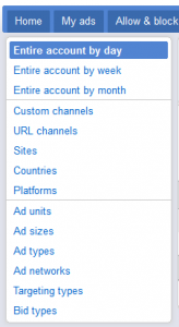
Under the Performance Report tab, the left sidebar provides you with a variety of report types.
- Ad units – displays performance reports based on an ad unit (an individual or a set of ads displayed based on the results of one piece of AdSense code repeated in different spaces on your website).
- Ad sizes – displays performance reports based on the different ad sizes you have used on your site.
- Ad types – displays performance reports based on the different types of ads ultimately displayed, including images, text, rich media, flash, etc. This is especially useful if you have allowed all ad types, and want to see if some do better than others.
- Targeting types – displays performance reports based on contextual targeting, placement targeting, and interest-based advertising.
- Bid types – displays performance reports based on ads that are paid by CPC (cost per click) or by CPM (cost per thousand impressions).
To makes sense of the reports, you’ll want to familiarise yourself with common digital advertising terms such as ad click-through-rate, matched revenue per thousand impressions (matched RPM) and revenue per thousand impressions (RPM). Google has a comprehensive glossary for the terms that are used in its AdSense reports. In addition to the glossary, Google also has this 2-minute video that provides a step-by-step explanation of how to use advanced reports.
Custom channels
A custom channel is a group of ad units defined by you for reporting purposes. For example, you might create one custom channel for your homepage, and one for a section front and another for a layout that you are trying out at the top of a page.
When creating a custom channel, you can also check the option for “Show this custom channel to advertisers as a targetable ad placement”. This important option allows you to optimize placement targeted ads by creating a channel which groups ad placements by topic, ad format, or location on a page – all important distinctions for advertisers looking to buy a specific location or reach a particular audience. Once you check this option, you will be asked for more information:
- Ads appear on: Note where ads in this placement appear on your site – on the homepage, or on other types of pages.
- Ad location: Select the location on the page where ads in this placement appear. For example, you might make a placement featuring ads in the top right of your pages.
- Description: This is what an advertiser will probably use to decide whether to place the ad or not so be very specific. Even go so far as to suggest an audience type who will likely view these ads.
- Site language: The primary language of your site content.
URL channels
These are custom channels for reporting on your ads based on the directory structure of your site. By entering a top-level domain name or main web address of your site, you can track all the pages on that domain, or you can enter a partial URL, which would allow you to track ad performance on a particular section on your site.
Google Analytics
If you are using Google Analytics for your website, you can also link your AdSense data with your Google Analytics account, which will give you even more information about who is clicking on your ads. For example, you can see the geographic region where they’re coming from, what referring site sent them to your site, and how long they stay on your page before clicking an ad.
To see your AdSense data, either click on the Content section in the Google Analytics navigation sidebar for your AdSense reports, or click the AdSense Revenue tab for a breakdown of your traffic by AdSense impressions, clicks and revenue in many other reports.
Google has a tutorial on how to link your AdSense and Analytics accounts.
Optimising your ad performance
Linking AdSense to Google Analytics is just one way to measure the performance of your ads so that you evolve your strategy to get the highest possible returns from your ads. You’ll want to interpret your data and make small, informed changes to improve your advertising strategy. There are several different ways to optimise the performance of your ad network advertising. According to Google:
- Wider ad sizes tend to perform the best because of how much easier they are to read. AdSense suggests a few sizes that work best when you create your ad unit, but it is important to keep in mind your own website’s layout.
- Customise the colours of text, links and the ad background to integrate better with your site.
- In general, ads located above the scroll tend to perform better than those that require users to scroll to see.
- Ads placed near navigational aids and other engaging content also perform well due to high visibility.
Google has a number of suggestions for the best layouts to drive ad performance.
Limiting ads through blocking
Of course, the best way to optimize the amount of money you get for ads is to allow as many advertisers as possible to enter the ad auction, simply and easily. However, you could have ads placed on your site that are offensive or ads for your competitors that you would want to block from advertising on your page. To block or limit ads, you can click the Allow & Block Ads tab to include specific URLs, topics, sensitive categories, or even specific ad networks.
You also do have the option, on your settings page, to hold all ads for a 24-hour review period before they show up on your site. However, the default is to run ads immediately which will maximize your potential revenue by opening up the competition to more ads.
Other Google ad services
Connect with high-quality advertisers
The Google Affiliate Network is a free service to connect accepted publishers to high-quality advertisers, currently supporting websites from 80 countries. It allows for a more flexible pricing scheme, determined between you and the affiliate. But it also requires more pro-activity to keep up your relationship with the affiliate advertisers. See the publisher optimisation checklist for an overview of how to stay on top of things.
Learn more about the Affiliate Network.
Keeping up-to-date information in DoubleClick Ad Planner
The DoubleClick Ad Planner is a free service that allows advertisers to quickly find websites that match their target audience. So it is important to make sure that your website information is complete and up-to-date so the right advertisers will find you. In your DoubleClick Ad Planner publisher profile, you can include a 250 character description of your site, the URL of a page on your site that describes how to advertise with you, up to five categories reflecting the content of your site, the different advertising types, formats and sizes that your site supports and whether you would like to share your Google Analytics data with DoubleClick Ad Planner.
The first step to create your profile is to claim your website in the Ad Planner. See instructions for how to claim your site.
Find more information on DoubleClick Ad Planner.
Test different designs and pages
This new service allows you to do some advanced A/B testing on your website. You can create up to five different versions of a webpage and when someone visits the site, they will be shown one of these options. Then you can report on these different webpage options against your Google Analytic goals to understand how different layouts impact your click-through rate (see future issues of the Digital Briefing for more about Google Analytics and goals). Learn more about the Google Content Experiment, or get an overview on how to setup a content experiment.
Special service for small business
DoubleClick for Small Businesses is free service (if you serve less than 90 million monthly ad impressions, not including AdSense ads) provides you with several features to take greater advantage of your AdSense account. If you are at a point where you have begun to receive requests from advertisers, or you manage multiple ad networks, or you just need greater control over your ad delivery, the service will help you to do all of that. For example, you can limit the amount of times a user sees the same ad within a given period, or enable real-time competition between Google AdSense, Affiliates and third party ad-networks, or you can create mobile-specific targeting options. See a full list of features.
Other AdSense products
- Link Units: display a short list of related topics that the user clicks on to get even more targeted ads. This is a smaller display and can be useful in spots where an ad unit wouldn’t fit into the layout.
- AdSense for search: Create a Google search on your site and if a user clicks on one of the ads in the search result you will earn revenue. The search can be just for your site, for a collection of sites, or for the whole web. You can also prioritise or restrict the search to a section of your webpage.
- AdSense for mobile content: Google ads on your mobile webpages
- AdSense for feeds: Google ads in your feeds
- AdSense for video: InVideo overlay and text overlay ads for your video content
- AdSense for games: advertising specifically for games played within the browser
- AdSense for domains: links, search results, advertisements and other content for your unused domains
- AdMob: Google ads for your mobile applications
To get a more in-depth view of AdSense, you can go through the thorough online lessons at the AdSense Academy.
Warning: How not to increase revenue
AdSense has fairly strict policies against certain practices that would encourage fake click-throughs. A big one is masking ads – you cannot make it difficult to distinguish ads from your content. You also cannot use any language to encourage people to click on the ads, or place misleading labels above ad units such as “Favourite Sites” or “Today’s Top Offers”. Google advises to avoid partnering with untrusted or low-quality ad networks, search engines or directory sites in an effort to increase traffic. Lastly, there is a strict rule against clicking on your own ads – even if you’re interested in an ad or looking for its destination URL. Instead of clicking on the ad on your site, Google advises you to use a search engine to find the URL for that company.
Creating your account
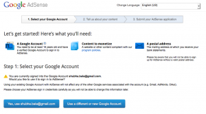
1. If you already have a business Google account, you can use your existing username and password to sign up for AdSense. If you don’t have a Google account, you’ll need to sign up for one first.
2. Choose the primary website for your AdSense account. This will generate a code that you can use not only for the primary site you used for registration but your other sites as well.
At this point, you’ll also be asked the primary language for your site. AdSense has complete support for some 30, mostly European and major Asian, languages. For a handful of other languages such as Slovenian and Estonian, AdSense will serve ads in those languages but the user interface is available only in one of the main languages. Although you have to choose a primary language for your site, the service will serve ads in other languages on pages in those languages on your site.
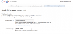
3. You’ll next be asked to read and agree to some simplified terms and conditions to use the service. You must agree:
• Not to click on ads on your site nor encourage others to do so.
• Not to place ads on sites which include adult content.
• Not to place ads on sites that distribute content for copyright that you do not own.
• That you do not already have a Google AdSense account.
4. Enter your business details. Note that the screenshot before is assuming personal details, so you will additionally need to enter the name and address of your business, making sure that the contact name and address are the same that you use on the bank account for your business. You will also be asked how you found out about AdSense and also if you want to receive email updates from AdSense, some of which promote new services and others that provide you with information on how to get the most out of your digital advertising.
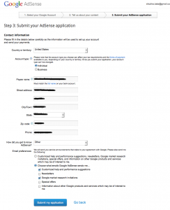
After you click the button marked “Submit my application”, you’ll see a thank you message that also explains that you will receive an update on the status of your application in about a week. While you’re waiting for approval of your site, as Google suggests, it is useful to familiarise yourself with the service using their Newbie Central site for new users of AdSense.
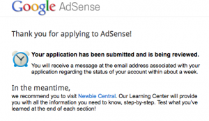
5. A couple of days after you submit your application you should receive a follow-up email from Google letting you know that they have completed their partial review of your website. In Google’s words, “after a new application is submitted, we’ll begin with preliminary checks on the site and the applicant’s submitted details”.
Adding AdSense to your website
Once you pass the partial review, you will need to set up your ad account and put an “ad unit” on your website for Google to complete the full approval process. An ad unit is an ad of a specific size, design and ad type. The e-mail you received about your successful partial review will contain instructions to log on to your AdSense Interface and get started.
1. Terms and Conditions. After you log in the first time, you’ll need to read and agree to the full terms and conditions for the service.
2. After agreeing to the terms and conditions, you’ll be taken to the AdSense interface, which at the moment is blank because you have not added any ads. Click on Ad Units and the button “+New Ad unit”

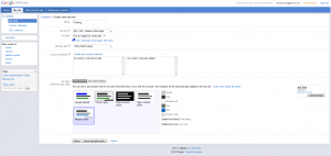
3. Now you will create the first ad unit for your website. Each ad unit will have its own tracking code. You can use this code on multiple places on your website to show multiple ads of the same format, but keep in mind that for reporting purposes they will all be grouped together making reporting much more difficult.
Type a name for this ad unit. Under Ad size you will see a long list of options, starting with the sizes that Google determined to be optimal for click-throughs. Ad type has several options – Text & image/rich media ads, Text ads only, Image/rich media ads only. For ad type, it is best that you select the option “text & image/rich media ads”, if possible. This will allow the most ads to bid for your space, thus optimizing your revenue. For now, you can ignore the option to create Custom channels as that is for advanced users. For AdStyle, it will be important to pick Custom, which will allow you to choose colours that are appropriate for your site.
4. Once you’ve created your ad unit, click the button to get the ad code. A window will pop up with code for you to copy into your website.
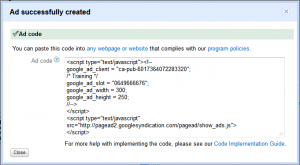
5. Now you need to put the ad unit code on your website so that Google can complete the approval process. Here is an example of how it could be very simply added to the sidebar of a WordPress website. Many content-management systems, including WordPress, have plug-ins that allow you to easily incorporate AdSense ads or other ad networks into your site. Whether your CMS supports such plug-ins or not, it is important to consider the type of ads and ad units you will use when designing your site.
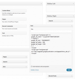
For the time being, your website will have a blank AdSense unit that blends in seamlessly with your site. Within about 4 days after you add the ad unit, Google should finalise approval for your site – and the blank units will begin to display ads. In the meantime, there will be dead space on your site but it should match in color and style to your website so there will be minimal disruption.
If you find an issue with adding the code, check Google’s a guide to troubleshooting common AdSense problems.
Setting up payment and finances
You won’t be able to set up payment options until after your AdSense account has been given final approval. Once that happens, you can add or edit your payment contact information by selecting Account settings under the Home tab on the AdSense management site. Here, you can also enter appropriate tax information, if required. Usually tax information fields will not be available until you’ve met a minimum threshold of payments.
After you reach the equivalent of US$10 in ad sales, you can choose how you want to be paid. After you make that selection, you will be mailed through the post a PIN which you will use to verify your physical address.
Lastly, once you reach US$100 in ad sales, and each time you reach US$100 thereafter, your payments will be processed. Note that receiving your payments could take up to 1-2 months.
]]>Digital Journalism
Print Media South Africa adds digital to its mix
The industry body Print Media South Africa has changed its name to Print and Digital Media South Africa to reflect that digital is an extension of what journalists do, not a threat. CEO of Print and Digital Media South Africa, Ingrid Louw, said:
We have taken a conscious decision not to defend our print past and present but to rally around written journalism – news and opinion – on whatever platform it is carried. We realise that print and digital co-exist and that journalism values remain the same on both platforms.
Indonesian online journalists to have own code of ethics
The Online Journalist Association (IWO) announced on Wednesday that it would be creating a code of ethics for online journalists by year end. Iskandar Sitorus, one of the groups founders, said that the the code of ethics was being developed to improve issues of professionalism that sometimes “occasionally trouble online journalists”.
Another group, the Alliance of Independent Journalists, outlined the problem in a survey of recent coverage of the Jakarta gubernatorial elections that found online media suffered the greatest number of violations of journalistic principles, such as verification and accuracy.
The Digital News Test Kitchen at the University of Colorado created a report on predict-the-news games, in part by its own experience rolling out such a game on the university’s news website. In addition to outlining their own experience, they give other examples of predict-the-news games which might spark some ideas for future ways to interact with your audience. The examples range from scoreboards showing top predictors of future news events, games in which you predict other people’s reactions to news, and even a fantasy-league supreme court game, similar to fantasy sports leagues but adapted for news applications.
Internet trends
25 surprising facts about Brazilian Internet users
Throughout the day Brazilian Internet users prefer going online over reading a newspaper (or watching TV), according to an IAB Brazil survey. Another statistic that jumped out at us is that “85% of female Brazilian Internet users say the Internet is very important to them, compared to 79% of the men who say this”.
Russian tech giants aim to replicate success abroad
Russian technology firms – search engine giant Yandex, social media network Vkontakte and Odnoklassniki – are determined to expand their overseas markets after presenting Google and Facebook with stiff competition in Russia.
Beyond the article, one market that Yandex is targeting is the rapidly growing Turkish internet market. Unlike in Russia, where Yandex comes out on top over Google, in Turkey, Google owns the market, according to Turkish newspaper Hurriyet. Yandex wants to win at least 15 to 20 percent of the Turkish market in three to five years. To help it build market share, it is partnering with all social media in Turkey, Yandex founder Arkady Volozh told BusinessWeek.
Mobile
Indians ditch newspapers for consuming content on smartphones
A new survey has found that 40% of the estimated 48 m mobile internet users in India have shifted 50% of their newspaper and TV time to their mobile screens. Popular content includes entertainment, all categories of news, travel and sports content.
Social Media
Facebook’s app center for non-English countries
Facebook rolls out its app center to non-English speaking countries – Brazil, France, Germany, Russia, Spain, Taiwan and Turkey. The App Center allows Facebook users to find new apps and games based on personalised Facebook recommendations.
Finish start-up Scoopinion launches frictionless sharing right
This Helsinki-based start-up provides both consumers of news, and producers of news, with frictionless sharing of news articles by sharing only articles that are relevant – not every frivolous click like Facebook currently does. It also provides journalists with detailed information about how long readers have read their article for, and even a heat-map based on scrolling patterns.
Such analytical tools allow journalists to understand how audiences are responding to the content they produce and develop ways to improve audience response.
Metrics and analytics
New Zopim makes it easier for you to engage your most important customers
Zopim, a Singapore-based start-up, has launched a new service, Triggers, to engage your most important customers by alerting you when key customers drop by your site. This tool could help news businesses engage with their most loyal consumer base and adjust to their preferences
]]>• Have a clear editorial focus for your crowdsourced project.
• Use crowdsourced reports to focus, not as a substitute, for your own reporting.
• Be clear about what crowdsourced reports are verified and unverified.
• Attempt to verify reports using multiple sources.
• Take care that multiple sources are not simply using the same source.[/stextbox]
Digital media can open reporting to everyone and crowdsourcing – a technique for collaboratively collecting information or analysing data – can be a powerful editorial technique that helps you tap into the expertise and experiences of your audience. However, crowdsourcing isn’t simply turning your journalism over to the masses. To be successful, crowdsourced projects need clear editorial goals and require oversight to maintain editorial accuracy and integrity. Credibility is what separates independent journalism from mere gossip.
Lauren Wolfe, the director of the Women Under Siege Project, was recently interviewed about the importance of accuracy in their project to map sexual violence in conflict, specifically in Syria. The project used Ushahidi, a crowdsourced reporting platform, to collect and display the initial accounts. Ushahidi has been used to help gather information for a range of stories including monitoring elections and also disaster response such as the earthquake in Haiti. The platform was recently used to map the impact of flooding in Kuban, Russia.
Coverage in Syria has been especially challenging for the media, as well as campaigners like Wolfe, because the Syrian regime has severely limited the access of international journalists to cover the conflict. To overcome these controls, Women Under Siege first collected reports using Ushahidi in what Wolfe described as a “live, crowd-sourced mapping project”.
We put together a team of epidemiologists, Syrian activists, and what we’ve done is put it out to the world, with different ways that people can report. They can come directly to the site, fill out a form. They can email us or they can use a Twitter hashtag – #RapeinSyria#. What it’s doing is it’s tracking perpetrators, so we have it broken down by is it the Shabiya, is it the government forces, non-government, what kinds of acts.
While Women Under Siege is a project to raise awareness of rape being used as a weapon in conflict, rather than a journalism project, Wolfe, a journalist who has written for the International Herald Tribune and CNN.com, believed she couldn’t sacrifice accuracy for advocacy. After a US Senator Joseph Lieberman raised the issue of rape in Syria, Wolfe called up his office to find out the sources that supported his allegations. She and her colleagues found:
…two out of three sources Lieberman’s office cites are the same source, one that is easily understood to contain information on the rape of men in detention in Syria but no substantiation of “widespread” rape and sexualized violence.
In our daily work of putting together reports of rape and other kinds of sexualized violence for our Syria crowdmap we have become very conscious of an echo chamber. It’s a concept all reporters know (or should): that information gets repeated from source to source until it begins to sound like fact—it’s just the thing that happened, everybody knows that. But when it comes to something as sensitive as rape in war, we have to be particularly mindful of the delicate propaganda war being played by all sides.
She has identified a problem that applies not just to crowdsourced reporting but also to traditional journalism, and the kind of rigour she employs should be part of all of our journalism, not just crowdsourced projects.
In crowdsourced projects, the verification process often happens in stages. Some reports will be easy to verify, while other reports will require more time and effort. During this process, it’s important to communicate to audiences which reports you have been able to verify and which reports you haven’t. In an interview with NPR’s On the Media (below), Wolfe talked about balancing the tensions of advocacy and accuracy, and about “walking the tightrope that is reporting rape in Syria”:
Information is coming out but it’s coming out with agendas attached to it. And there’s nothing more propagandistic than saying, you know what? The opposing side is brutalizing our women. What we have to do is try to triangulate and verify. So I’m working with Physicians for Human Rights and a team of epidemiologists at Columbia. What we’re doing is marking down all the reports as unverified, and the hope is as things calm down, we’ll be able to figure out which ones might have happened and which ones were really just false.
However, she goes on to say that, in a region such as Syria where there are many reasons for a woman not to report rape, it is important to create an environment where women feel comfortable coming forward with reports. Crowdsourcing reports from people who might be at risk if it was known they had participated requires care and a sense that their information and identity is secure.
Collaborating with your audience can bring new information and sources to your reporting. It can build a stronger bond with your audience, but collaborative projects have to be done in a way that maintains one of your most precious assets, your credibility. Make sure that you develop and maintain an editorial process for crowdsourced projects that is consistent with your editorial values.
Wolfe’s interview with On The Media:
]]>Journalists need to be data-savvy… [it’s] going to be about poring over data and equipping yourself with the tools to analyse it and picking out what’s interesting. And keeping it in perspective, helping people out by really seeing where it all fits together, and what’s going on in the country
Building on this trend, MIT and the Knight Foundation recently held their annual Civic Media conference, and this time the theme was “the story and the algorithm” – the place where data meets narrative. From the conference website:
Data, shared by governments, corporations, researchers, and increasingly by the public, is changing the ways we report and share news. We are developing new techniques to navigate this data and transform it into visualizations and insights that reveal unexpected truths about our society. But data alone isn’t always enough to make complex issues understandable. As data proliferates, the ability to present a clear story becomes even more crucial.
Attendee Ben Colmery, Deputy Director of the Knight International Journalism Fellowship, blogged about some of the news apps to help journalists engage with data and fact checking. Here’s a few of the ten that caught his eye:
• LazyTruth and TruthGoggles are both apps that bring fact-checking straight to the reader. LazyTruth is a ‘widget’, or small application, that works with Google’s webmail service, Gmail, to automatically fact-check content received in e-mail. In a similar vein, TruthGoggles “will alert online readers to suspicious claims in posts that fact checkers like PolitiFact have examined”.
PolitiFact is a Pulitzer Prize winning project in the United States that checks the accuracy of statements made by politicians. It grades the statements on a scale, from ranging from true all the way to “pants on fire”, (from the English childhood phrase, “liar, liar, pants on fire”).
• The technology magazine Wired has created a plugin for the popular blogging content-management system WordPress that connects it to GitHub, a system used by software developers host code to allow collaboration with others. GitHub allows for software versioning, allowing changes to be made to software that preserves previous versions.
For writers and journalists, you can think of it much like track changes in word processing software like Microsoft’s Word. WordPress already tracks changes made to articles internally, but the plugin is being created by journalists at Wired magazine to allow readers, not just their own journalists and editors, to correct typos, fact-check, and translate articles. It raises interesting questions for how journalistic integrity will remain, but it is exciting as it “engages people in the process of generating truth”.
• Data Therapy is a project to build the data capacity of small community groups. This could be useful for many local media outlets in developing countries that have an interest in enabling their audience be able to be more engaged with the data that surrounds them, especially as more and more governments become willing to open up their data.
What data tools and apps do you think will be game changers, positively or negatively, for your news outlets?
]]>